Global cosmetics company Avon is a household name, but last year the brand became aware that its identity had been diluted over time and had become inconsistent across various platforms.
It made the decision to overhaul its visual and verbal identity and worked with London-based creative agency Free The Birds on the project.
Nick Vaus, Partner and Creative Director at Free The Birds said that Avon didn’t initially set out with the intention to undergo a rebranding process and had just asked Free The Birds to redesign packaging portfolio. However, as the project unfolded, it became increasingly obvious to Vaus and his team that to achieve a successful packaging redesign, a broader transformation of the current brand was necessary.
“Avon is an iconic beauty brand, but like all heritage brands it needs to stay relevant and that requires purposeful transformation,” said Vaus. “It became very obvious very quickly the power and potential a total brand identity refresh would unlock.”
"One cohesive strategy"
The solution was a branded house approach: one cohesive strategy with a new visual identity for all brand channels and applications to exist under.
When Free The Birds undertook the redesign of one of the world's largest beauty brands in the planet, they approached it with great care and respect for its rich heritage. “The guiding principle was to build upon the brand's history, and thus, retaining and refining the existing logotype was the optimal starting point,” shared Vaus.
He said the thought process behind the brand redesign had two major objectives:
1) To incorporate the brand's positioning of 'Embrace Your Power' into the brandmark in a meaningful way, reinforcing and fortifying the brand while providing added protection.
2) To ensure that the brandmark remained distinguishable and effective, even when scaled down to the size of a small mascara in print advertisements.
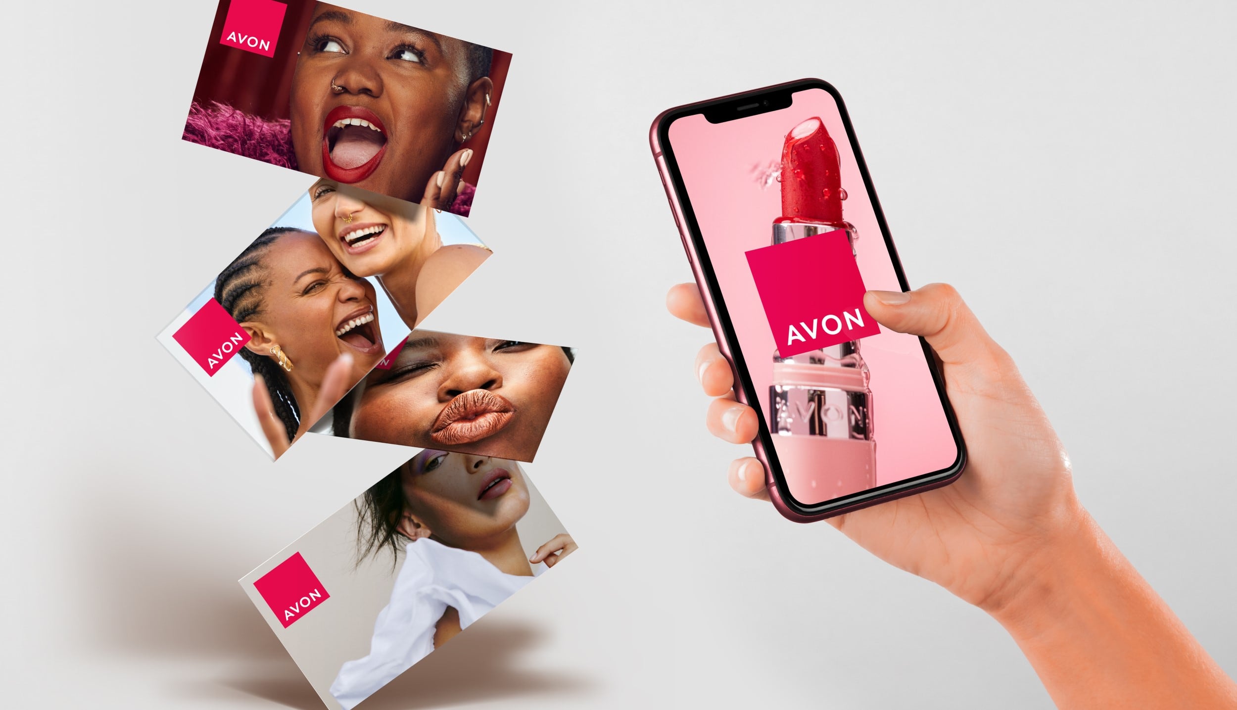
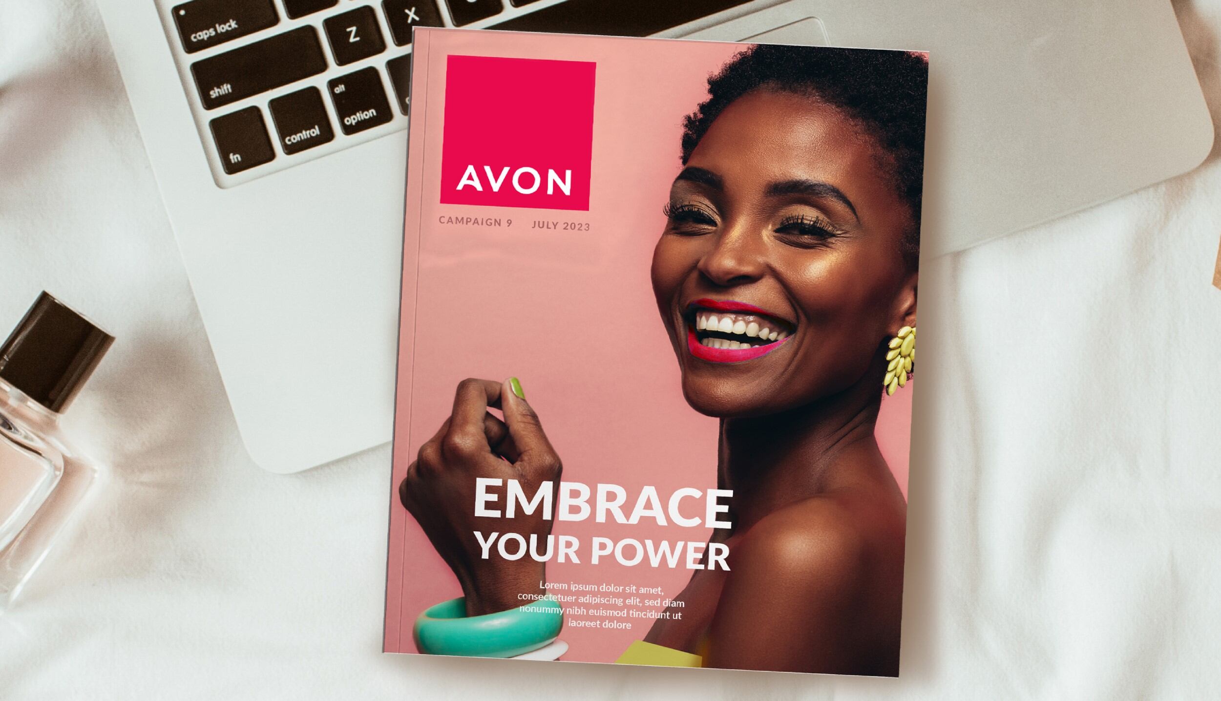
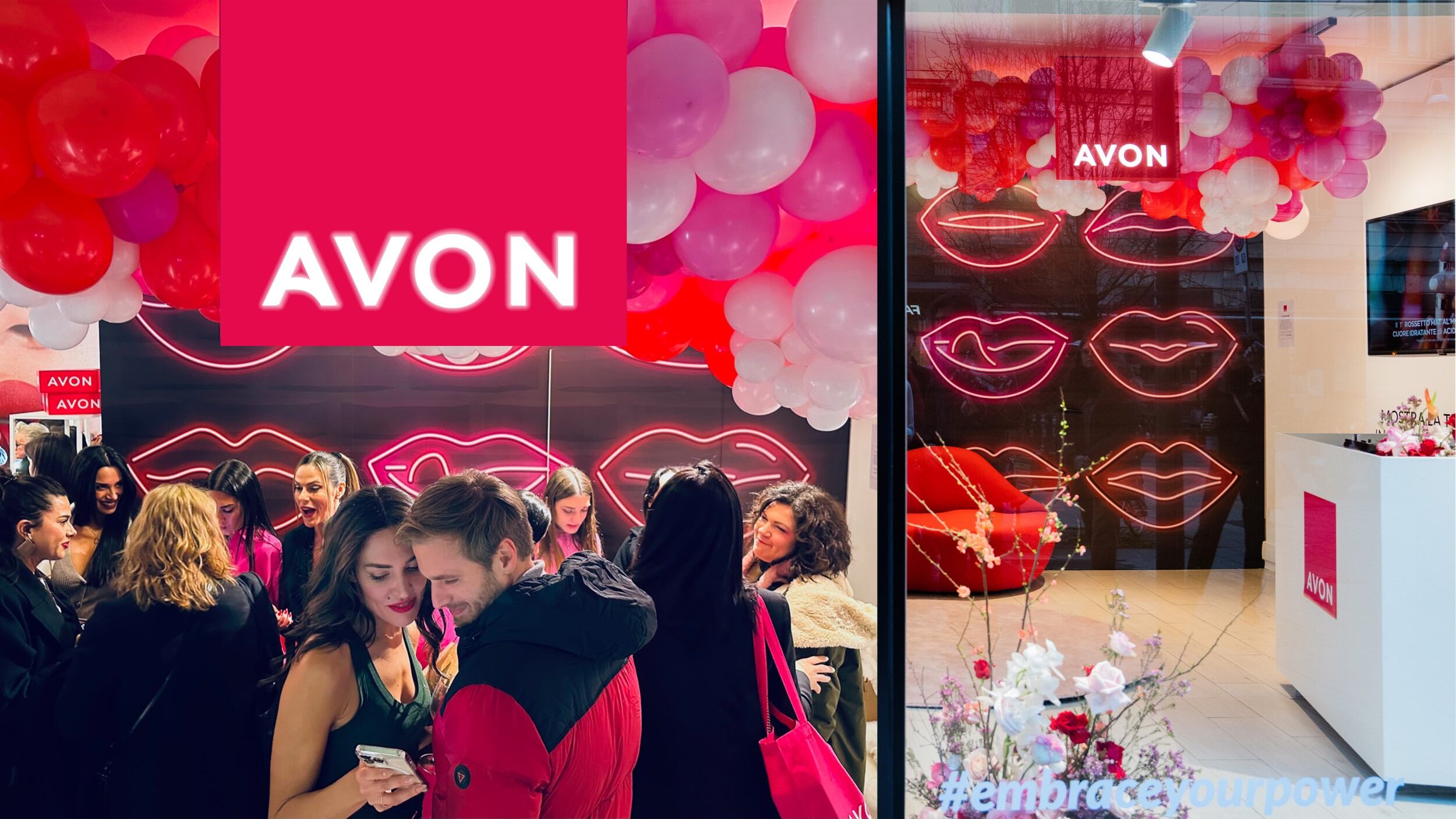
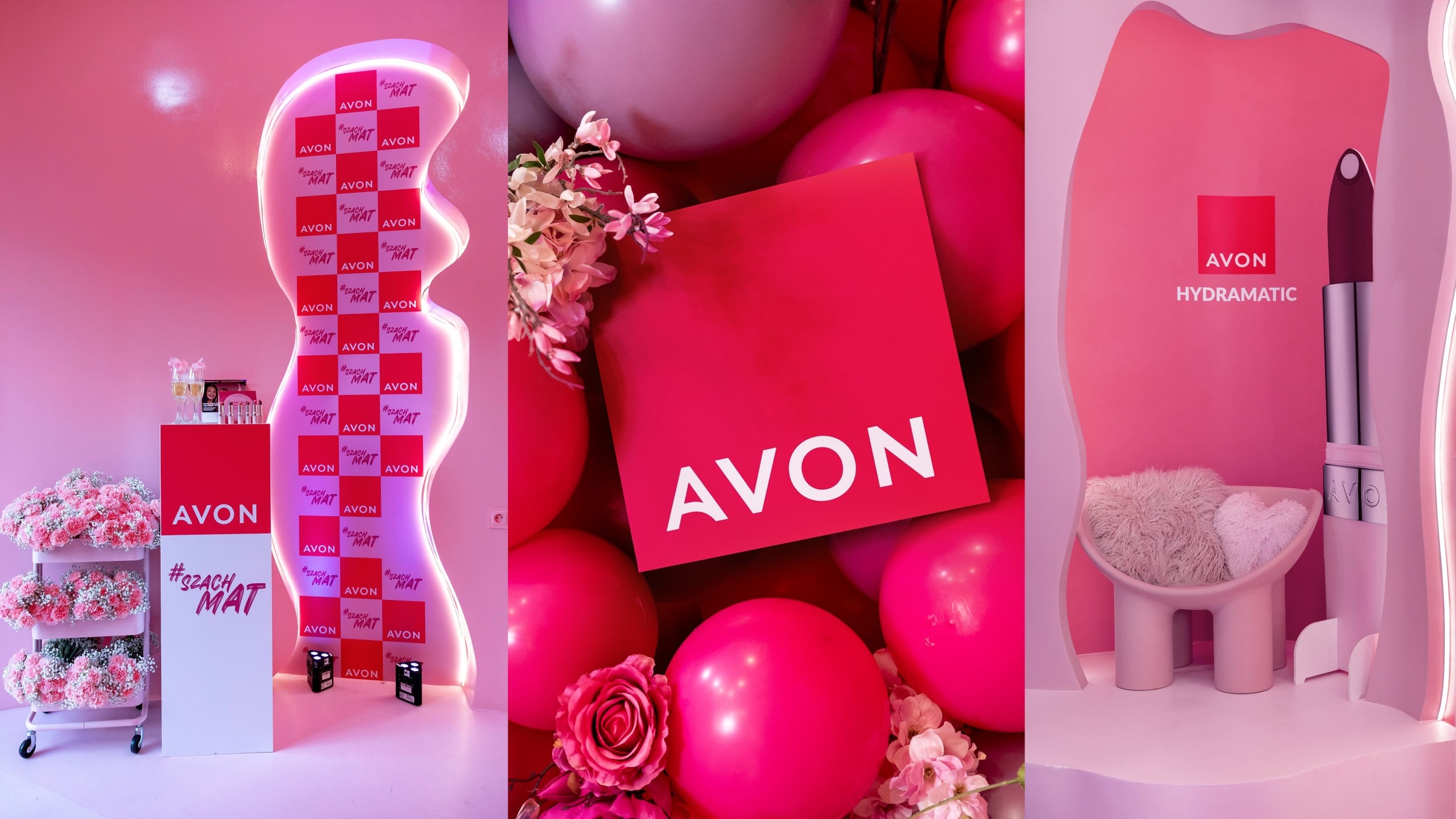
The brand now has a new hallmark logo, packaging design, website and social media assets.
All brand equities – brand colour, primary typography and other brand elements including photography style, advertising layouts, brand guidelines and brand visual personality – work with Avon’s new ‘Embrace Your Power’ brand positioning, which was launched earlier this year by Wunderman Thompson. The result is a whole new visual identity.
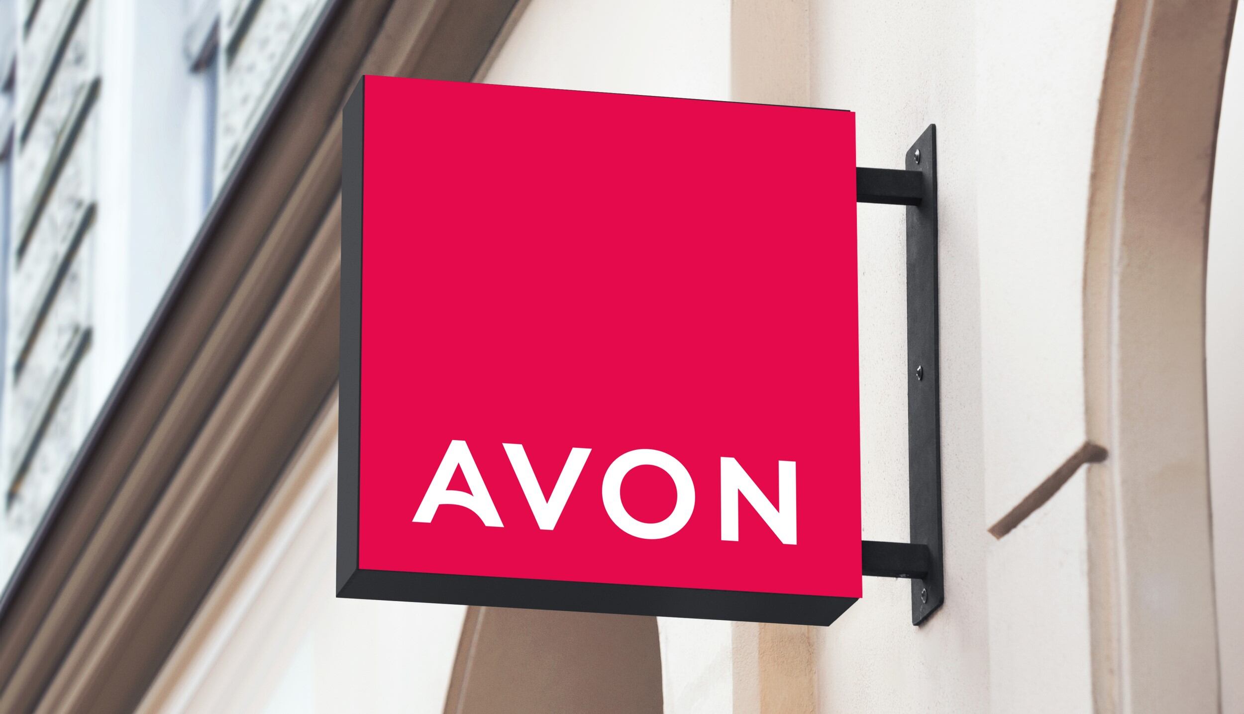
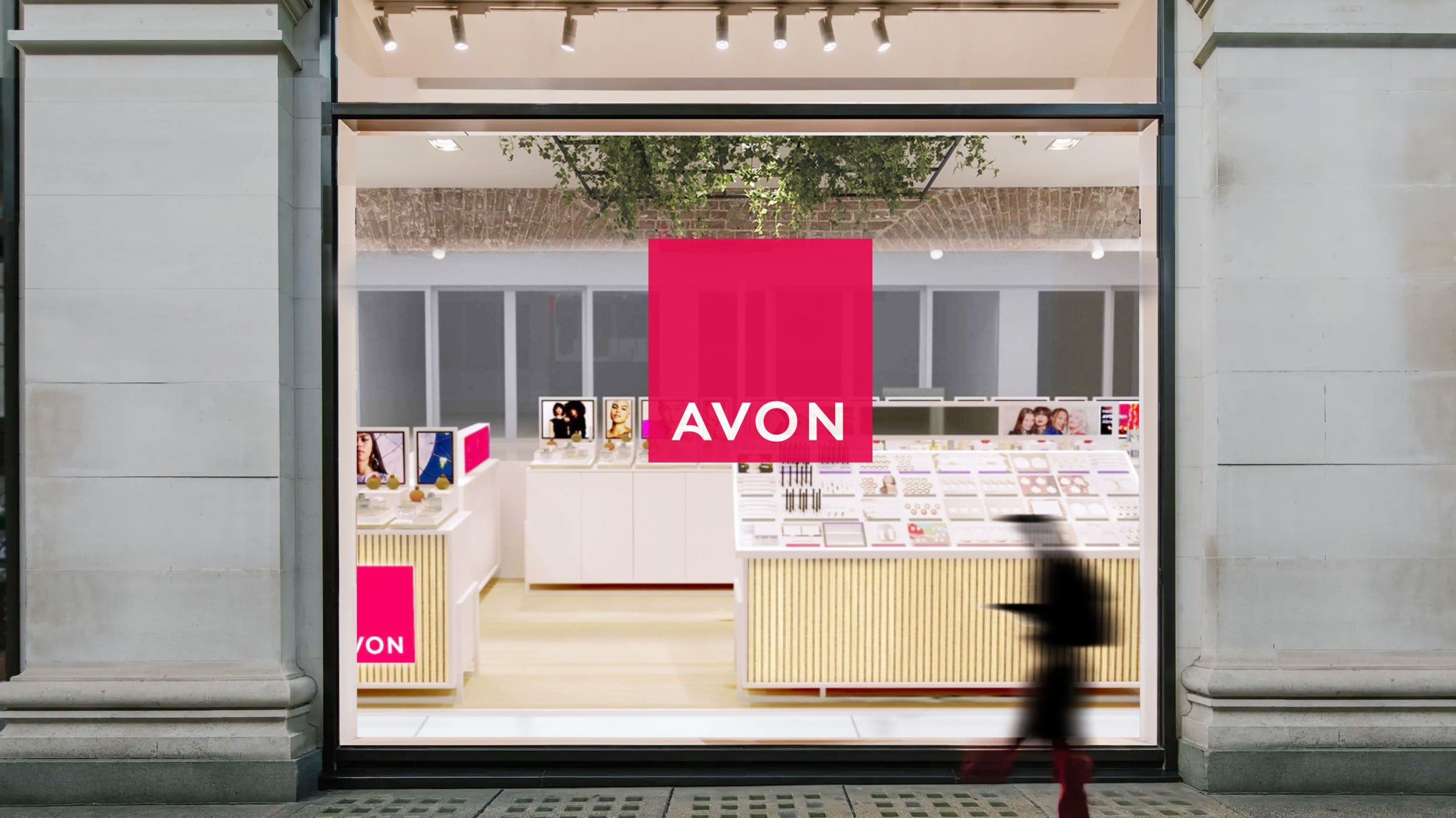
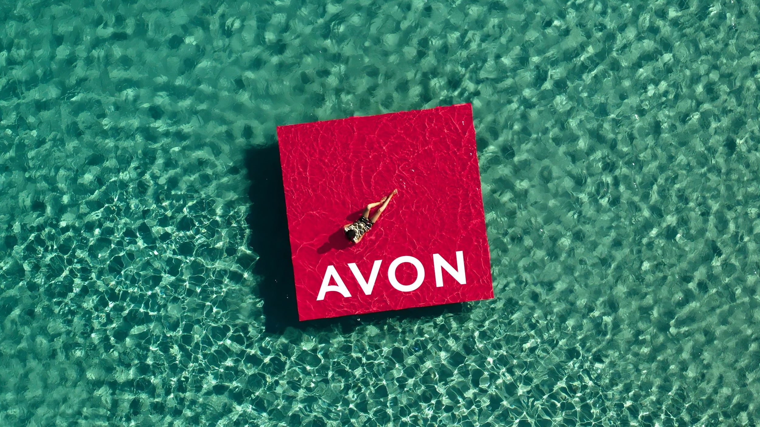
Free The Birds housed the hallmark logo in a strong plinth shape in ‘iconic power pink’ to be optimistic, bold and mobilising and also reflect brand values, such as the brand’s longstanding commitment to the breast cancer cause.
“The bold pink block is symbolic of the platform which gives women opportunities, elevates them and encourages them to ‘embrace their power’,” said Vaus. “At Free The Birds we believe in putting an idea into every design which we create.”
As well as using new colours to reflect Avon’s new positioning, Free The Birds partnered with Dalton Maag to evolve the logo typeface, balancing the need to remain true to the original to ensure brand recognition, but also refining the font.
“Consistency plays a pivotal role in managing a brand that spans multiple countries and regions,” shared Vaus. “Building a brand with straightforward guidelines is essential, ensuring that both internal teams and third-party suppliers can seamlessly apply them.”
"A hallmark and foundation to be noticed"
Vaus explained that often, new brand identities may appear appealing initially but prove challenging to implement on a global scale.
“This commitment to consistency has resulted in a significant visual strengthening of the brand,” he said. “Previously, it had a subdued and apologetic presence. It has now evolved into a hallmark and foundation to be noticed.”
Furthermore, he explained that the adoption of a single, distinct colour has replaced the previous vignette of brand colours. “This not only simplifies implementation but also serves as a quick visual cue for consumers to begin recognising the brand,” he said.
Vaus said the redesign, repositioning, and all the communication efforts have revitalised the brand, giving it a fresh and contemporary appeal that will resonate with a broader audience and a younger demographic.
Avon’s CMO Kristof Neirynck also shared that the aim of the rebrand was to “celebrate Avon’s USP in the market, which has always focused on creating products that help our customers feel the best version of themselves.”
Working with Free The Birds allowed us to bring the Avon brand in line with this bold level of multi-channel transformation, and we’re thrilled with the outcome of the collaboration on this project,” he said. “The brand now matches the energy and empowerment that Avon brings to our employees, Representatives and our customers.”
The rebranding campaign is currently being implemented across Europe, Middle East & Africa, South Latin America, North Latin America, and Asia Pacific territories.
